Dilhan.W
← Back

We’re replacing Figma-only designs with a sharedlibrary of ready-made components so theproduct can launch faster and every team saves time.

Role
Lead, design system project · With 2 designers
Timeline
3 months · Alongside other projects
Platform
GitLab
Product
HRC Design System 2.0
Scope
Research, Figma variables, UI components, tokens
Tools
Figma · Claude · Codex
Team
4 members (designers 3, dev 1)
Status
Active · Used for 5 products

The business problem

  • The Figma UI kit was hard to keep up to date, and its screens no longer met business needs.
  • Building complex user journeys in Figma took too much design time.
  • Developers used a different design system and restyled it to match our designs, which slowed every release.

The solution

  • Phase 1 – One theme in light and dark mode in Figma, used for new product requirements.
  • Phase 2 – Built the components as a coded UI library with Claude, so the team shares working prototypes, not Figma screens.
  • Phase 3 – Handing it over to developers as an npm package. We are here now.
  • Phase 4 – Teams use the package, and design builds every requirement from the library.

The impact

  • 5 products already built with the system in phase 2.
  • The team now builds requirements from the published system.
  • Projected Figma saving of $1,872 a year.

01 · Problem & scope

The UI kit was slowing everyone down. Not just design.

Four teams felt it in different ways. Fixing the kit alone would not have been enough.

Before

Design and dev do manual work

  1. 02Requirement comes in
  2. 03Update the Figma UI kit
  3. 04Draw every screen (light mode only)
  4. 05Link screens into a prototype
  5. 06Hand over to developers
  6. 07Dev restyles their own library

Now

The system does the work

  1. 01Requirement comes in
  2. 02HRC and domain skills ask questions by request type
  3. 03Build a working prototype from the library
  4. 04Share the demo with developers
  5. 05Dev uses the npm package

02 · The solution

Demo using HRC Design System 2.0

03 · Decisions

3 calls that shaped the system. Each with its tricky case.

01

Write a design philosophy first

Before choosing colours, we agreed on what the system should feel like. RCM means money, healthcare and compliance, so people are already stressed. One belief guides every choice.

The tricky case: a philosophy can stay a nice idea that nobody uses when they design a real screen.

How we handled it: we linked each principle to the components where it shows up, so every review can check against it.
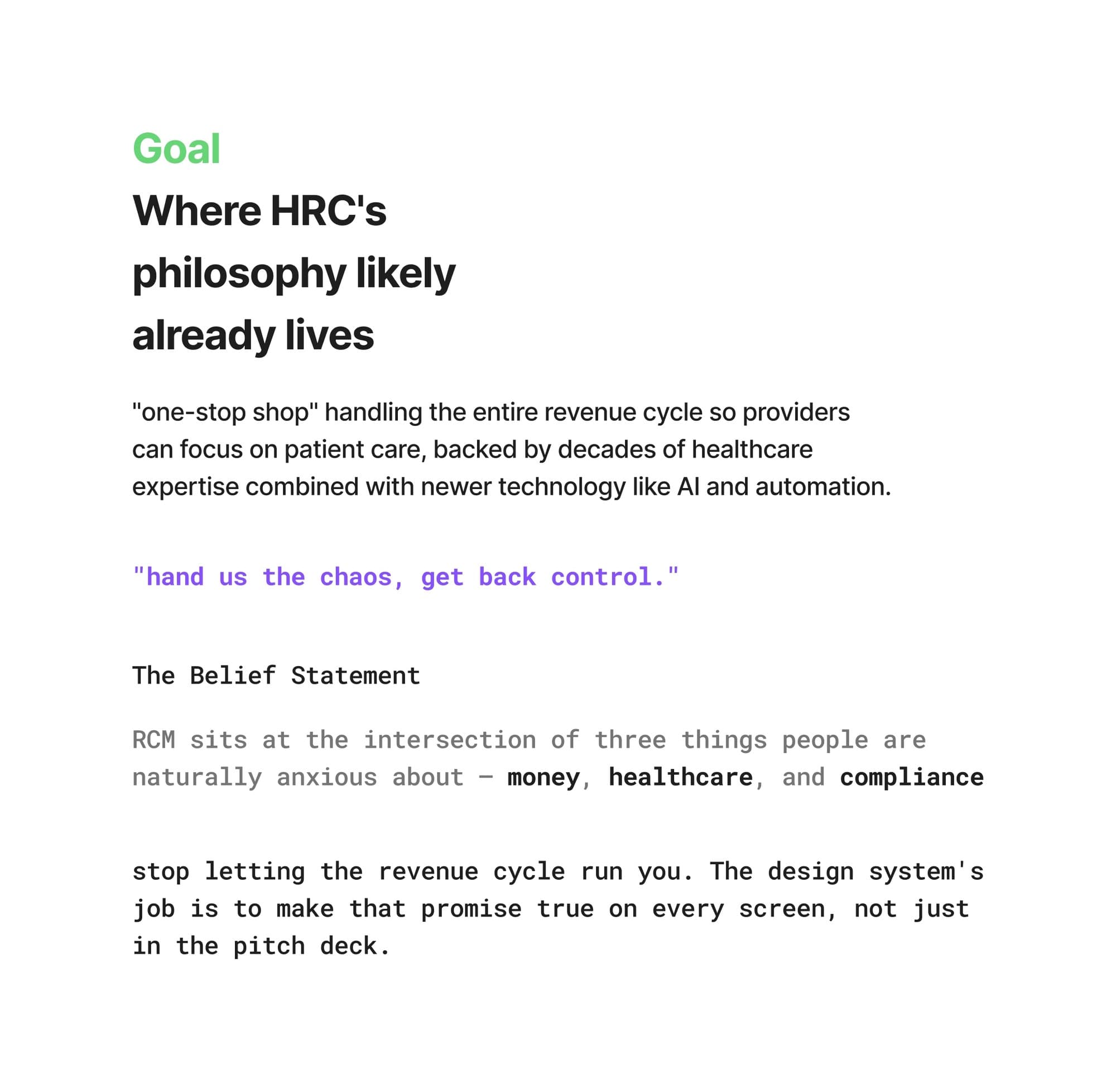
HRC’s design philosophy and the principles linked to components

02

Build what most products use first

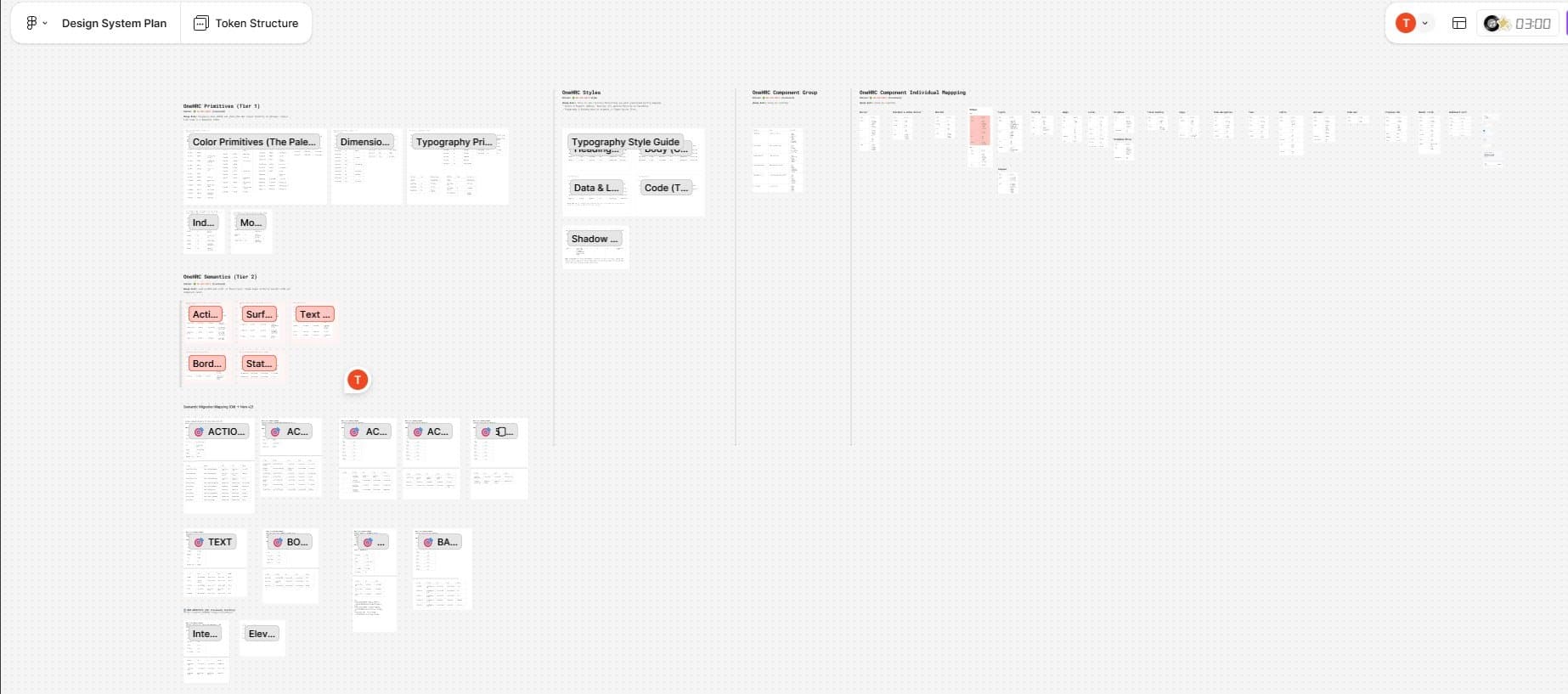
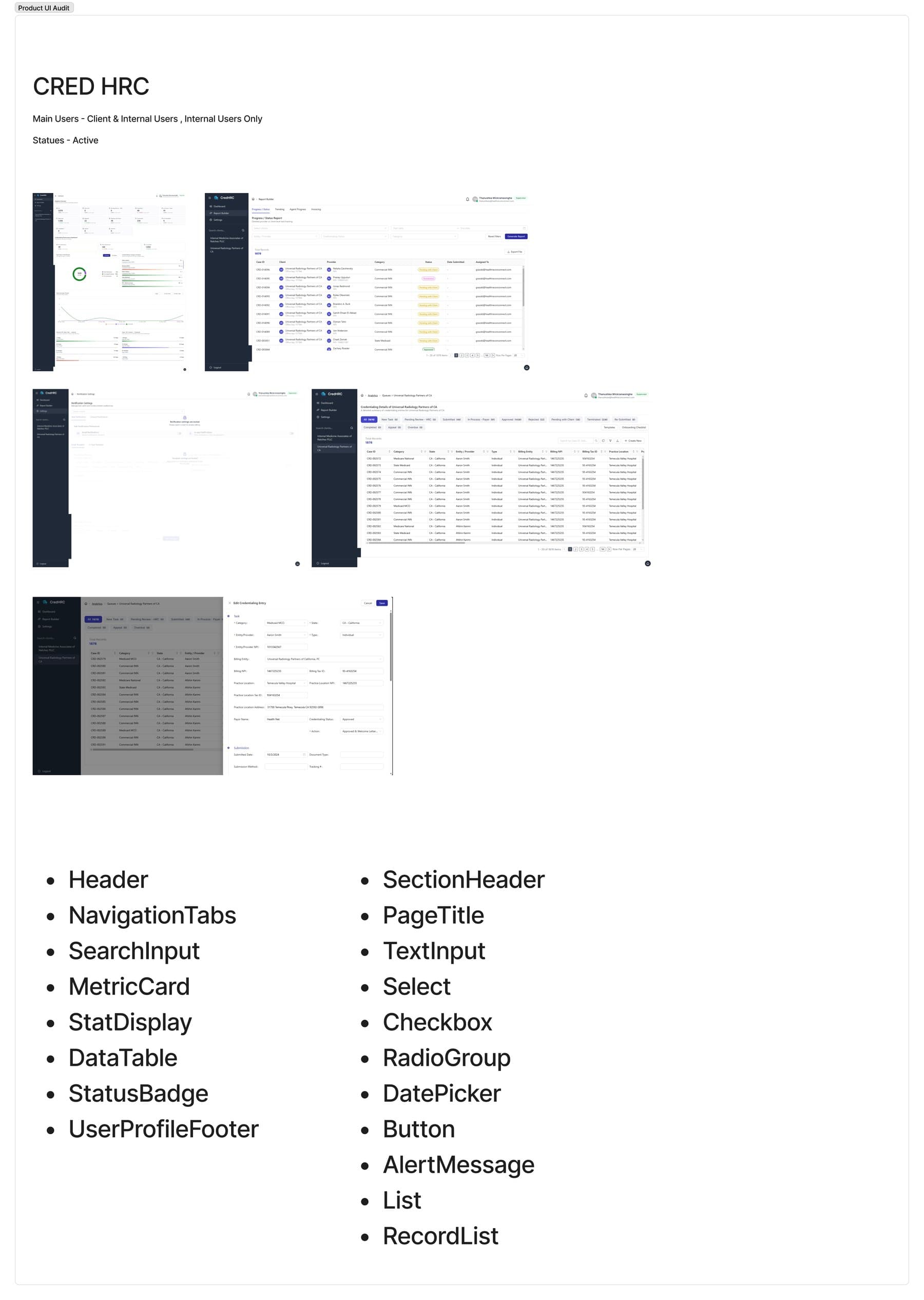
We audited the UI of our current products and built the shared components first, because they cover most screens.

The tricky case: some products need new layouts and a new experience, but there is no requirement for them yet.

How we handled it: we met BAs and PMs to get the context of every product, including ones not on the new UI, and planned their components for later.

UI audit of current products and the shared components built first

03

Map the token structure before the components

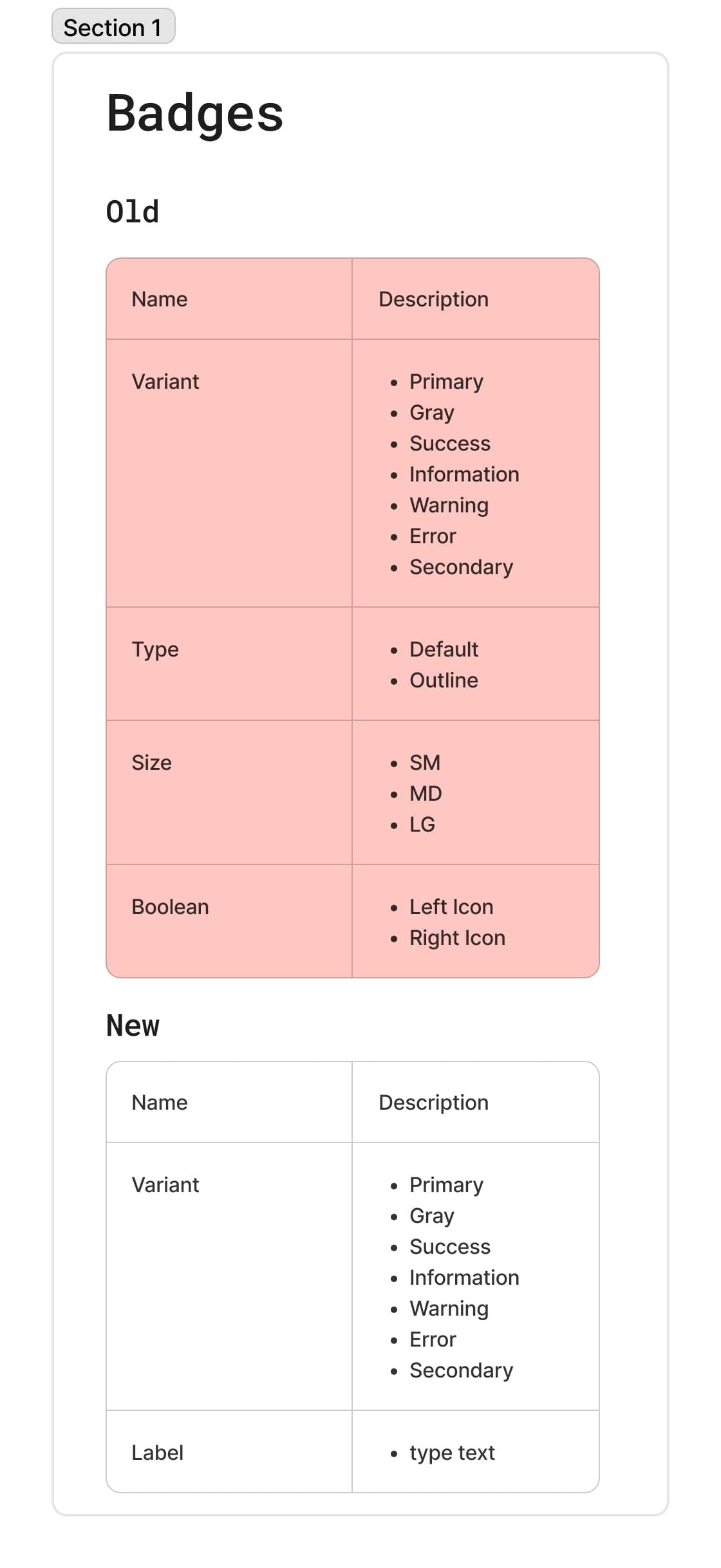
For each base component, we listed its properties first: variant, intent, size and state. Then we built the component and its tokens from that list.

The tricky case: one button can come in hundreds of combinations, which is hard to design and even harder to maintain.

How we handled it: each property became a setting, so one component covers every combination. Designers and developers pick settings, not separate buttons.

Component properties: variant, intent, size and state
Badge component with its property settings

04 · System & craft

How the system works. Not just how it looks.

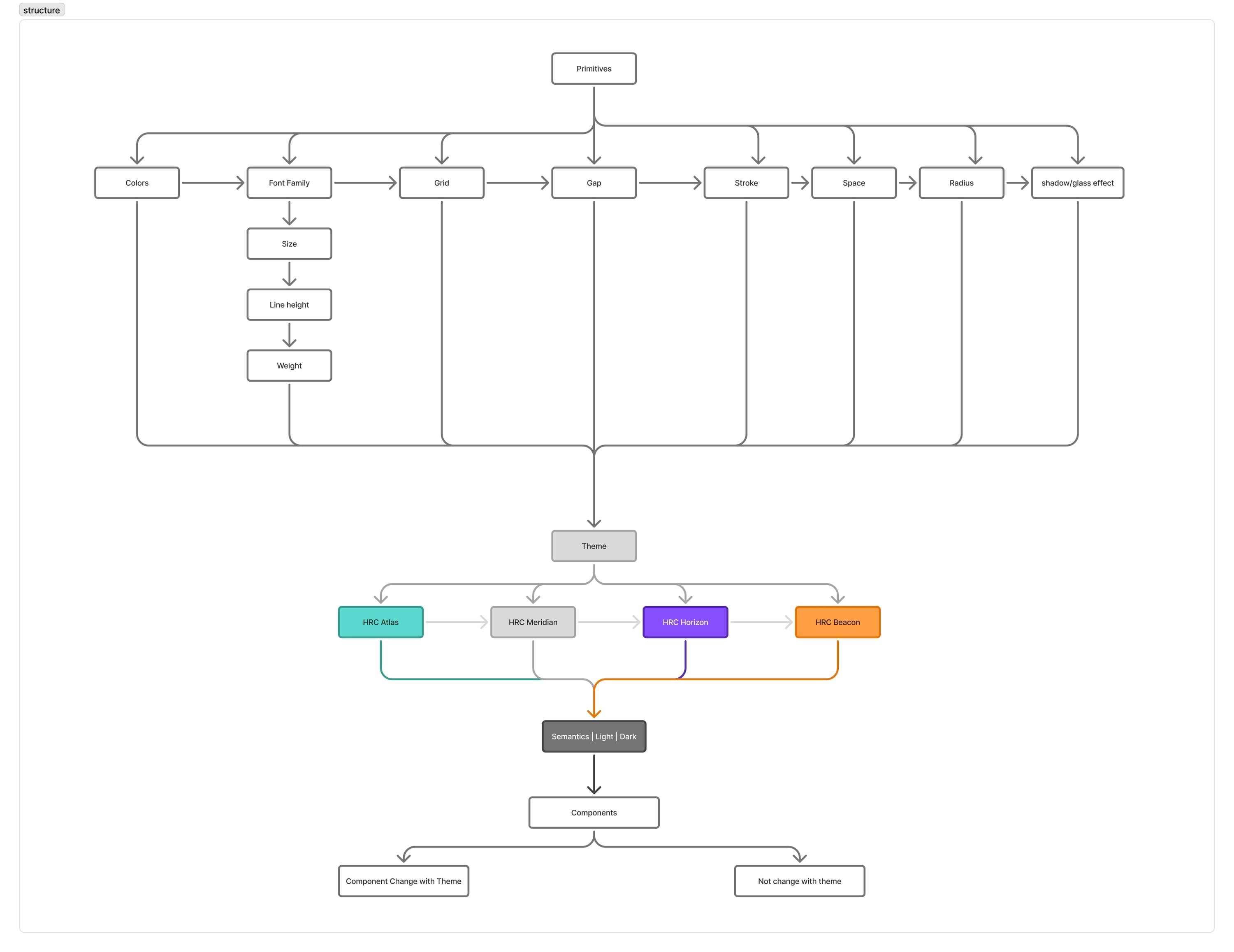
Colours and parts only matter if they scale. These five pieces show how one change reaches every screen, in every mode.

System architecture: primitives, theme and semantic token collections feeding components

System decisions

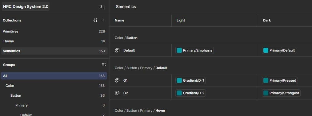
  • Figma variable collections: primitives, theme and semantics, with light and dark values

    Variables, not styles

    One change updates every screen, in every product.

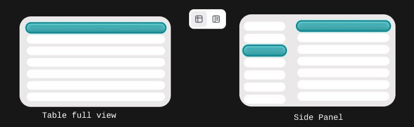
  • Table full view and side panel view of claims

    Two ways to go through claims

    View claims in full or one by one in a side panel. QA and operations can quickly review and update statuses for over 1,000 claims.

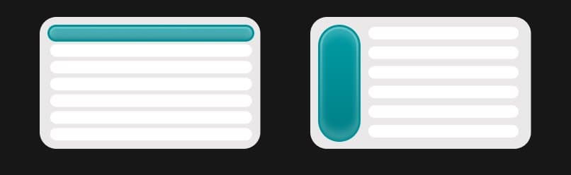
  • Top navigation and side navigation layouts

    Pick your navigation style

    Detailed-claims users (ops, clients) prefer full screen; a setting lets them choose top or side navigation.

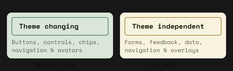
  • Theme-changing components versus theme-independent components

    Only some parts change with the theme

    We mapped brand-themed components in light and dark mode; the rest stay neutral.

05 · Outcomes

How we’ll
prove it.

1-3 Max

Days from requirement to prototype

100%

New UI built from the package, target Q1 2027

10-15

Products on the system

4

Product revamp using new design system within a week

06 · What I’d change

Three things I’d do differently.

Audit

We spent too long auditing.

Make audit a separate phase with a clear end date.

Team

Informal developer support delivered in a week.

Informal senior dev help finished it in a week. Secure dev time upfront next time.

Business

Business plans shape the system.

Plans like an AI-native product change what the system needs. Know them early to update ahead.